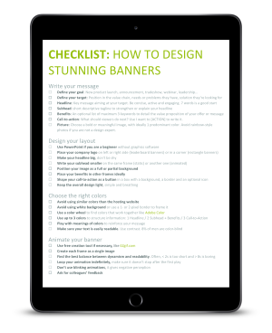
1 - What’s a banner for?
Even though banners exist for decades, many marketers still expect the wrong outcome out of a banner campaign.
The first thing you need to clarify before diving into the design of your banner is to understand what it’s meant for.
A banner has 3 objectives, and their importance drastically decreases from the first to the third:
- Main objective: Convey a short and meaningful message aligned with your brand
- Secondary objective: Raise brand awareness and recognition in a given audience. It can be massive or targeted.
- Icing on the cake: Drive a bit of traffic on your landing page
A common mistake is to assume that your banner will generate a huge traffic because it will be massively seen. Looking at Google benchmarks, the figures are clear. The average CTR (click through rate) of a banner ad is only 0.35% on Google Display Network.
2 - Write your message
What is the objective of your campaign?
Before writing or designing anything, you need to clarify your objective. You may be launching a new product, exhibiting at a trade show, announcing a merger/acquisition or rebranding a product line, or simply asserting your market leadership.
Your banner message and design will have to reflect this specific objective.
Who is your target?
Defining who you are talking to will help you choose the right words that speaks to them. Listing their needs, pains and objectives will help you frame a powerful message by which they will feel concerned.
What is your message?
Now that you have a clear idea of your objective and target, it is time to write your story. The typical structure looks like this:
- A strong headline: It is the key message of your banner. It can be a sentence or a question. As viewers will only scan your banner, limit your title to 7 words to stay catchy.
- A complementary subhead: This is a short tagline used to empower your headline, answer the headline question or expose the value proposition of your solution. Tip: Not sure that your value proposition is good? Watch our video on what is a good value proposition for your specialty chemicals.
- The benefits [optional]: List up to 3 keywords to detail the value proposition of your offer. They are even better used with animated frames.
- Call-to-action: Even if a banner isn’t meant for driving traffic, it is still important to include a call-to-action. What should the viewers do next after reading your message? Tip: to phrase a good call-to-action, use “I want to [insert your call-to-action]”.
- Picture: As a banner is visual, you need to use a strong visual to support your story and convey your message. Everybody knows that a picture tells a thousand words. Choosing the right image will increase your banner effectiveness.

3 - Design the layout
Best practices for an effective banner layout
Every banner is unique and sharing a universal template is impossible. However, there are best practices to follow and basic layouts which you can use to ensure your banner effectiveness.
- Keep your overall design simple, light and breathy. You’ve got only a few seconds of visitors’ attention, don’t waste this short amount of time, get to the point.
- Catch the attention with your image. This is the first thing viewer must see. You can place it on left or right side, or even as full background.
- Place your company logo on one side. It gives more design flexibility for your design.
- Make your headline big, as big as you can. It must be the second element that viewers will see.
- Write your subhead smaller, below your headline or on another frame.
- Align your headline and subhead to the left or center.
- Shape your call-to-action as a button (a background color, an outline and even an icon), underlining the text is not enough.
- Optional: If you use benefits, position them on the right side (for static banner) or on a different frame (animated banner).
- Avoid white background or use an outline if you can’t avoid that choice. There is nothing more ineffective than a banner blended with the website.
Example of effective banner layouts
Here are some ideas of effective static and animated layout, with good banners examples published on SpecialChem websites:
-1.png)
-1.png)
-1.png)

.gif)
4 - Choose the right colors
Colors play a pivotal role in your banner perception.
If well used, they will increase your message efficacy and leave a positive footprint of your brand and message. But a bad choice of colors can lead to a cheap, amateur and poor banner, as well as decrease the performance of your branding campaign.
Here are useful tips to avoid falling into the usual traps and get a professional and impactful visual.
How to structure information with colors
The first thing to consider with the colors of your banner is the color scheme of the website on which it will be displayed.
As your banner must stand out, using similar colors will make it unnoticed. This is why you must always avoid using colors matching the website color palette.
A frequent mistake we can see is the use of a white background on a white website, without banner borders. It is hard to understand if this is a banner or a website element at first sight.
Tip: if your banner and the website have the same background color, always frame your banner with a 1 or 2 pixels border.
Now you know which color you have to exclude, you can start choosing the colors you want to use.
Follow this guide to structure your message with colors:
| Light background | Dark background | |
|---|---|---|
| Primary color - Headline |
Option 1: Dark or deep color Option 2: Corporate color Option 3: Vivid color but not flashy |
Option 1: White Option 2: Vivid and light color |
| Secondary color - Subhead - Benefits |
Option 1: Medium grey Option 2: Brighter or greyish version of the primary Option 3: Matching color from color wheel (complementary, triad, split) |
Option 1: White Option 2: Vivid color, slightly darker or lighter than primary |
| Third color - Call-to-action |
Option 1: Vivid color which contrast with the primary and secondary Option 2: Primary or secondary Option 3: Corporate color |
Option 1: Vivid color Option 2: Primary or secondary Option 3: A corporate color Option 4: White |
Example of color hierarchy
How to reinforce messages with colors
Every color can convey various feelings, emotions or messages. The table below is giving ideas of color meanings which you could use to reinforce the message of your banner.
Meaning of colors
| Brown | Natural, reliable, honest, comfort, warmth, simple, unsophisticated, confidence, reassure |
| Red | Passion, love, courage, energy, excitement, attention, anger, danger, strength, power, stimulating, vibrant, exciting, desire, urgency, attention, caution |
| Orange | Warmth, enthusiasm, happiness, joy, optimistic, independent, creativity, fun, motivation, inhibition |
| Yellow | Optimism, fresh, joy, energy, illuminating, success, confidence, energy, happiness, positivity |
| Green | Nature, life, renewal, refreshing, peaceful, environment, bio, restful, safety, harmony, balance, reliability, revitalize, encourage, reliable, forest |
| Blue | Trust, sea, sky, calm, honesty, loyalty, secure, integrity, cool, relax, calm, order, technology, healthcare |
| Violet | Imagination, spiritual, compassion, mystery, magic, reflection, royalty, luxury, quality, psychic, wisdom, creativity |
| Pink | Love, compassion, femininity, tenderness, safety, vulnerability, playful, admiration, fascination, motivation, pulse, energy, creativity, fashion, beauty |
| White | Purity, simplicity, peace, innocence, open, humility, youth, empty, distant, cleanliness, neutrality |
| Grey | Neutral, practical, conservative, formal, quiet, unemotional, detached, gloom, depression, maturity, protection |
| Black | Power, control, authority, discipline, elegance, mystery, formal, fear, evil, sophisticated, sexy, secretive, intimidate |
How to combine colors
If you don’t have a strong artistic sensitivity, don’t worry. Free tools exist to create or even find modern and nice color palettes like color.adobe.com. But matching color is a child play as long as you apply the following rules:
-1.png)
5 - Animate your banner
Now you have created and designed each frame of your banner, it is time to animate them in a GIF.
You can use free GIF creator websites like ezgif.com to have a full control of each frame delay. All you have to do at this step is to find the perfect balance between a dynamic pace and enough time to read the texts.
However, many people tend to speed up their frames to make the banner dynamic, but pausing a bit on specific frames is key to let the banner prints into the viewer’s mind.
In the example below, the frames 3 and 7 have the longest timings to give plenty of time to the viewers to read the messages and strengthen the benefits and call to action.
Beware that timings below 2s are too short and don’t give enough time to read small sentences.
Above 8s, the banner starts to get boring.
Tip: Test different delays to see what’s working good or not and test with colleagues for feedback.
.gif)
Animated banner example with timing
Frame 1 0.3s | Frame 2 2s | Frame 3 3s | Frame 4 0.3s | Frame 5-6-7 1s each | Frame 8 8s
BONUS: Can I use PowerPoint to create my banner?
The support of an agency or a designer is strongly advised to get the most professional results.
But in case you don’t have access to those resources, and want to create the banner on your own, finding the right software to do it can be complicated.
Too complex software like Illustrator, Photoshop, or freeware like Gimp, Inkscape and Paint.net could completely lose you. But using wrong software will lead to amateur result.
If you are not familiar with any graphic software, the easiest solution is to use PowerPoint.
Why?
Because you certainly already know how to use shapes, edit color, crop images, align elements etc. Plus, it gives flexibility in terms of layouts.
Tip: To create shapes with the exact size you need, right click the shape, select size and position and add "px” to your number in the width and height fields and press Enter. Ex: 200px.


