
"My products aren't known or considered by enough specifiers." It's the top marketing challenge cited by 44% of suppliers who contacted SpecialChem in Q2 2026, and it isn't something a single campaign fixes. It takes an ongoing visibility and education program: what SpecialChem calls Demand Creation. It's built to reach the specifiers who aren't shopping yet: 95% of your market, according to a 2021 Ehrenberg-Bass Institute study. That way, you're already on their shortlist when a decision point arrives.
A single campaign, a few weeks of ads, then nothing until the next launch, doesn't build that kind of recognition. Visibility and education work better as habits than as events. It takes several campaigns running across the year, not one. That way, a specifier who isn't in-market today still sees your name when they're in-market. The Ehrenberg-Bass Institute has tracked what happens when brands "go dark": sales fall an average of 16% after one year and 25% after two, with smaller and declining brands hit hardest.
Banners are one of the most common building blocks inside that kind of program, easy to place across the industry sites your specifiers already read. Most suppliers expect a banner to drive traffic that converts into leads. In practice, a banner's job inside a visibility program is to build recall, not to generate clicks. Here's how to design a banner that builds that recall.
1 - What’s a banner for?
A banner ad has three jobs, in order of importance:
That order matters more than ever. According to WordStream/LOCALiQ's 2026 Google Ads benchmark, banner ads on the Google Display Network average a click-through rate of 0.35%–0.46%. Even GlobalSpec's own high-impact "Welcome Ad" reports a click-through rate of 1.88%. It's a premium overlay format run across GlobalSpec's engineering network. That network includes a dedicated Chemicals & Plastics channel.
Different websites, different formats, same conclusion. Even a well-targeted, well-designed banner earns a click from a small minority of the specifiers who see it. Treat a click as a bonus, not the target. The first two jobs are what a visibility program is actually paying for.
Clicks get outsized attention because they're easy to measure, and measurable numbers justify budgets. For a more rigorous way to measure and prove the ROI of your marketing initiatives, SpecialChem's ROI model introduction webinar can help. It walks through assigning a tangible value to each marketing initiative.
2 - Write your message
What is the objective of your campaign?
Are you launching a product, exhibiting at a trade show, announcing a merger, or asserting market leadership? Each objective shapes the message and the design approach.
Who is your target?
Identifying who you're addressing helps you select language that connects with their needs and pain points.
What is your message?
Now that you have a clear idea of your objective and target, it is time to write your story. The typical structure looks like this:
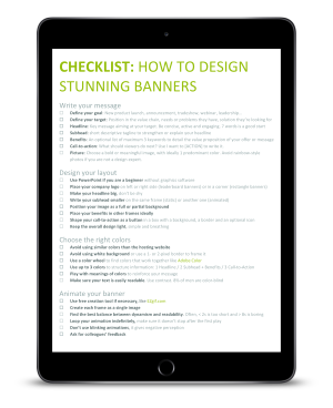
3 - Design the layout
Best practices for an effective banner layout
Every banner is unique and sharing a universal template is impossible. However, there are best practices to follow and basic layouts which you can use to ensure your banner effectiveness.
Example of effective banner layouts
-1.png)
-1.png)
-1.png)

.gif)



4 - Choose the right colors
How to structure information with colors
Banners must contrast with the website's own color scheme to remain noticeable. For example, a white background on a white website, with no border, makes it unclear whether you're looking at a banner or the page itself.
Follow this guide to structure your message with colors:
| Light background | Dark background | |
|---|---|---|
| Primary color (Headline) |
Option 1: Dark or deep color Option 2: Corporate color Option 3: Vivid color but not flashy |
Option 1: White Option 2: Vivid and light color |
| Secondary color (Subhead/ Benefits) |
Option 1: Medium grey Option 2: Brighter or greyish version of the primary Option 3: Matching color from color wheel (complementary, triad, split) |
Option 1: White Option 2: Vivid color, slightly darker or lighter than primary |
| Third color (Call-to-action) |
Option 1: Vivid color which contrasts with the primary and secondary Option 2: Primary or secondary Option 3: Corporate color |
Option 1: Vivid color Option 2: Primary or secondary Option 3: A corporate color Option 4: White |
Example of color hierarchy
How to reinforce messages with colors
Every color can convey various feelings, emotions, or messages. The table below gives ideas of color meanings which you could use to reinforce the message of your banner.
Meaning of colors
| Brown | Natural, reliable, honest, comfort, warmth, simple, unsophisticated, confidence, reassurance |
| Red | Passion, love, courage, energy, excitement, attention, anger, danger, strength, power, stimulating, vibrant, exciting, desire, urgency, attention, caution |
| Orange | Warmth, enthusiasm, happiness, joy, optimistic, independent, creativity, fun, motivation, inhibition |
| Yellow | Optimism, fresh, joy, energy, illuminating, success, confidence, energy, happiness, positivity |
| Green | Nature, life, renewal, refreshing, peaceful, environment, bio, restful, safety, harmony, balance, reliability, revitalize, encourage, reliable, forest |
| Blue | Trust, sea, sky, calm, honesty, loyalty, secure, integrity, cool, relax, calm, order, technology, healthcare |
| Violet | Imagination, spiritual, compassion, mystery, magic, reflection, royalty, luxury, quality, psychic, wisdom, creativity |
| Pink | Love, compassion, femininity, tenderness, safety, vulnerability, playful, admiration, fascination, motivation, pulse, energy, creativity, fashion, beauty |
| White | Purity, simplicity, peace, innocence, open, humility, youth, empty, distant, cleanliness, neutrality |
| Grey | Neutral, practical, conservative, formal, quiet, unemotional, detached, gloom, depression, maturity, protection |
| Black | Power, control, authority, discipline, elegance, mystery, formal, fear, evil, sophisticated, sexy, secretive, intimidate |
How to combine colors
If you don’t have a strong artistic sensitivity, don’t worry. Free tools exist to create or even find modern and nice color palettes like color.adobe.com. But matching colors is child's play as long as you apply the following rules:
-1.png)
5 - Animate your banner
Free GIF creators like ezgif.com let you control frame delays. Balance dynamism with readability. Timing between 2 and 8 seconds per frame works best, and pausing on specific frames helps the banner print itself into the viewer's mind.
Beware that timings below 2s are too short and don’t give enough time to read small sentences.
Above 8s, the banner starts to get boring.
Tip: Test different delays to see what’s working well or not and test with colleagues for feedback.
.gif)
Animated banner example with timing BONUS: Can I use PowerPoint to create my banner?
6 - BONUS #1: Can I Use PowerPoint to Create My Banner?
If you don't have access to design software like Illustrator, Photoshop, GIMP, or Inkscape, PowerPoint's familiar shape, color, cropping, and alignment tools cover the same ground. Pro tip: right-click a shape, select size and position, and add "px" to the width and height fields to set exact pixel dimensions.
7 - BONUS #2: AI Design Tools for Your First Banner Layout
Free or low-cost AI design tools can now generate a first banner layout directly from a short text description of your message. Canva's Magic Design, Adobe Express, and Microsoft Designer are three examples.
None of these change what a banner is actually for inside a visibility program. Most specifiers who see a well-designed banner still won't click it, and that's expected, not a failure. What good design buys you is recall: the specifier who's seen your name enough times that they already know you when they're ready to compare suppliers. That's the outcome SpecialChem's Demand Creation is built to support. It keeps your brand on the shortlist of specifiers not yet shopping. That way, the eventual sales conversation starts from familiarity instead of a cold introduction.
FAQ
Do banner ads still work if nobody clicks them?
Yes. A banner's main job inside a visibility program is to build brand recall among specifiers who aren't shopping yet, not to generate clicks.
How often should I run banner ads?
Visibility and education work better as habits than as events. Running several campaigns across the year, rather than one short burst, keeps your name in front of specifiers consistently. That way, you're already recognized when they eventually start comparing suppliers.