Have you ever tried to kill your audience with one of these charts?


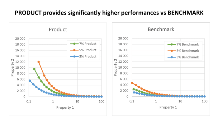
This type of chart is a legend within the chemical industry. And I wouldn’t believe it if you told me that you have never seen one of these in your career. Complex charts are almost a norm when suppliers want to show the difference between their products and a benchmark.
The reality is that everybody hates those charts! “What do they mean?”, “What am I supposed to look at?”, “Do I really have to break my neck to read that vertical axis label?”.
Victim or perpetrator, if you want to make it stop, you have come to the right place.
In this post, you will learn how to use layouts, colors and data to turn complex charts into attractive and effective narratives.
What is wrong with the traditional technical charts?
Technical charts try to accumulate data to sort out tons of problems. This is why they seem difficult to improve. What do you need to change, remove or keep in order to make your graph easier to understand?
Over the years, I have identified 5 types of problems:
- Unclear messages
- Ineffective layouts
- Bad use of colors
- Unrelated comments
- Static charts for complex stories
Now that you know what’s wrong, let’s review each problem one by one.
1 - Deliver a clear message, right in your chart title
When you design a chart, you already know what message you want to show. This message must be the foundation of your chart.
Every element — data, comment, color or piece of information — that you will add must serve that message, and only that message.
So the first step is to write your message as the title of your chart! “That’s one small step for man, one giant leap for mankind.” You just improved your chart by 50%. Unbelievable right?
Now, readers don’t have to decrypt your chart and guess what they should see. They can read it.
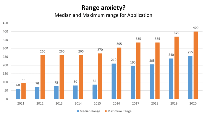
BEFORE: Guess what!
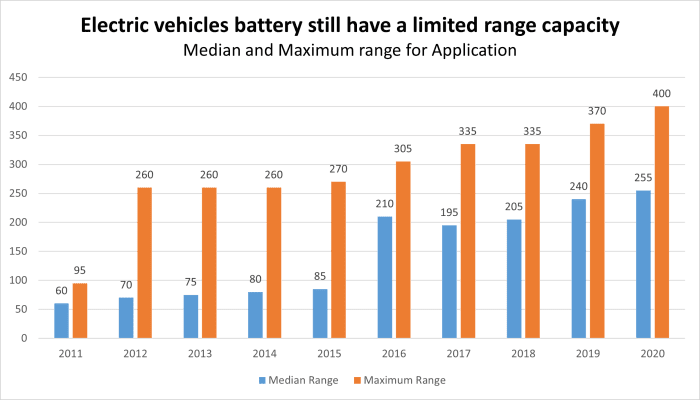
AFTER: Captain Obvious
2 - Keep you chart as light as possible
Once your audience has read the message, they need the proof. This is why the layout is the second most important part of your chart.
The chart layout can be split in 2 categories: The chart types (plots, bars, pies…) and the design elements (grids, axes, data labels, legends…).
Both the chart type and design elements have a major impact on your chart clarity and can help or hinder the communication of your message.
And guess what? Most charts have an inappropriate chart type combined with an overload of design elements.
I recommend you stick to these chart types:
- Horizontal bars: best for rankings and comparisons with a few or a lot of bars
- Vertical bars: best for ranking and comparisons with a few bars only (5-7 max)
- Plots: best for evolutions over time, concentrations, loadings...
- Slopes: ideal to compare an evolution at 2 different moments or states
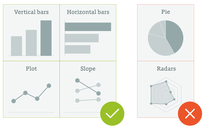
“Hey, you forgot the pie charts and the radar?” No I did not! Unless you are a chart master, throw them away. Your audience will thank you. The data is harder to compare on pie or radar charts. A bar or plot chart is usually more effective to convey the same meaning.
Oh, and... NEVER USE 3D EFFECTS! Use flat designs.
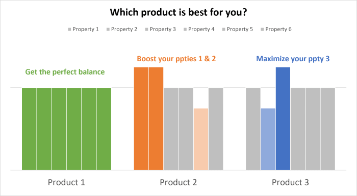
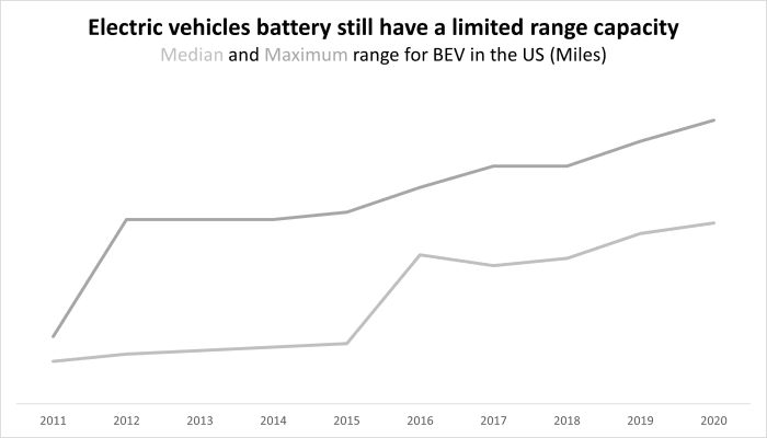
BEFORE: A confusing chart type. We don't even know where the green line goes.
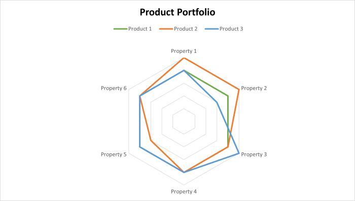
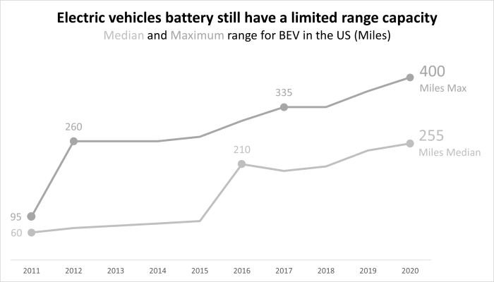
AFTER: A chart type that clearly shows the strengths and weaknesses
Once you have chosen the right chart type, I recommend you to remove everything that you can. The goal is to get rid of all visual and data pollution:
- Remove gridlines
- Remove axis labels
- Remove axis lines
- Remove data labels
- Remove legend
- Turn all colors to a grey scale
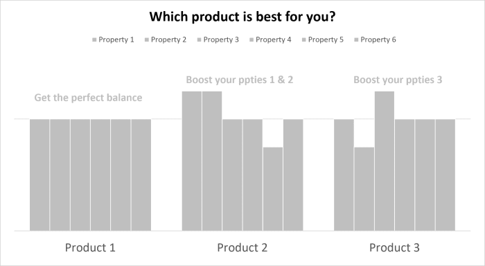
BEFORE: Too much visual distraction
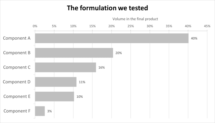
AFTER: Clean your chart so you can highlight what matter the most
Once your cleaning done, select the elements to display based on your story:
- Display the data labels that are important for your message
- Use plot markers to highlight important data
- Use on-chart legend or place it in your subtitle
- Use grids and axes only if it eases the understanding
- Never write in vertical. Nobody can or want to read it.
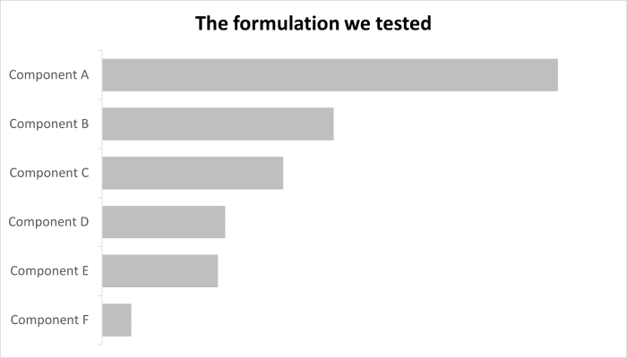
BEFORE: Start from a clean chart
AFTER: Only add the minimum and required level of information
3 - Use colors for a purpose
Colors are powerful. When you use them correctly, they clarify, structure and highlight your message. But in most cases, colors are used poorly and only bring confusion to the table.
If you use a color on a chart, it must serve a goal. And if it doesn’t, it is a distraction and must be turned to grey:
- Highlight a message
Colored elements stand out from grey ones. You can eve use contrast to reach the same goal. - Structure the information
It is ideal when you have several charts in your presentation. For example, Product A is blue and Product B is green consistently across your presentation. - Convey a meaning
This is when you use green for positive results and red for negative ones, or a color gradient in a heat map, etc. In charts, grey means two things: “We don’t care about this data” or “This is secondary information”. Which is why I recommend you start from a grey-scale chart.
BEFORE
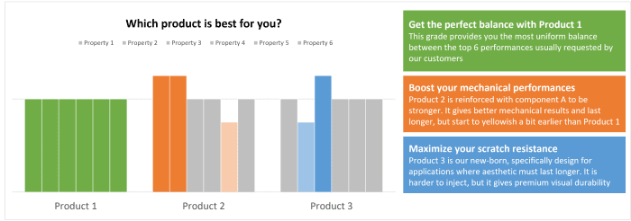
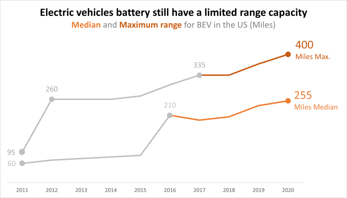
AFTER: Colors are used to structure the info (1 color by product) and highlight a message (light = weaker, dark = stronger)
4 - Add comments beside or even on your chart
Webinars, conferences, client meetings… everybody asks for the slides. So, your presentations will certainly end up in your participants’ mailboxes as a PDF. Then, they will review it later or even forward it to colleagues.
So, how can you make sure that your key messages will still be captured at that time?
Simple: Use comments!
You are certainly doing it today, but maybe not in the best way. So here are my tips for effective comments:
- Write your comment in the same color as its related on-chart elements.
- Make your comment self-speaking, even without looking at the chart. Write your key message and explain why you came to that conclusion.
- Use bold to highlight the keywords or key figures in your comment.
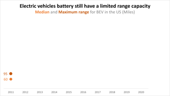
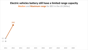
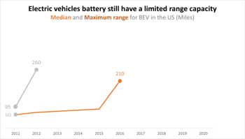
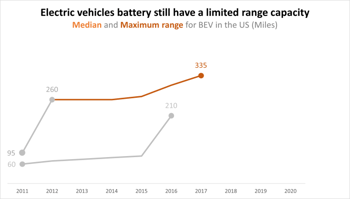
5 - Create an animated story
In front of an audience, most presenters show a static chart during their pitch. But when you are showing an evolution with bumps and drops, or comparing different things, you may have a long story to share, with different data and messages to highlight on each part.
The problem with static chart is that you are losing your audience. People are either trying to decrypt your chart or trying to understand where you are on the chart.
So… animate your chart!
For a live presentation, duplicate your chart into as many separate slides as there are key messages you want to deliver, and adapt each slide using the colors and data labels to only highlight the elements related to each part of your story:
For the PDF version, you can use only one chart for your story, but use comments as explained in the previous section to clarify each part.
Happy charting!